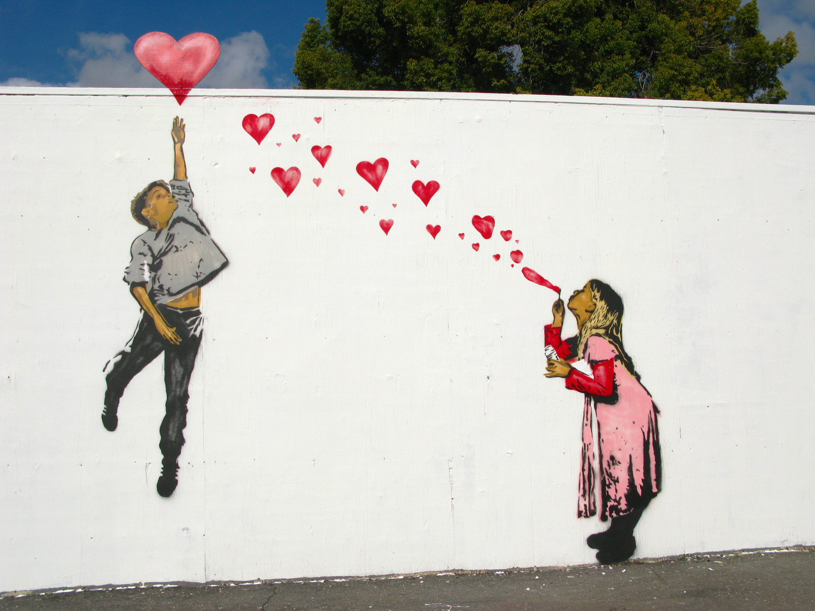
28 February 2013

Shutterstock

Shutterstock.com is a webpage to download high-quality licensed photos, vectors, illustrations and videos that you can incorporate into your work.  There are different memberships subscriptions and individual images can also be purchased.  With a full subscription 25 images can be downloaded a day.  One month, three months or year subscription can be purchased probably in a business with a high volume of work because it is fairly expensive.  The cost of individual images are: 1 image $19, 5 images $49 and 25 images $229.  Technically if you sign up for a free membership they will email you two free images every week to use as you like.  I have been doing that and have a folder on my computer to put them in. 

The photos and images on Shutterstock  are Royalty-free which is a type of stock photo license that provides unlimited use of an image in any media defined in the license agreement.  Customers do not technically buy the image but they "license" them.  You still own the rights to distribute and display your image or video, but a license gives the customer permission to use your work.  Also you can submit your photos, illustrations or videos for sale.  You do not get paid unless the image is downloaded by someone.  Here is the fee schedule for images sold: http://submit.shutterstock.com/earnings_schedule.mhtml.  It does not look like much but if it was a very popular download and many images maybe it would be profitable. 

Here is an images that I got for free.

27 February 2013

Free Ways to Show Off Your Portfolio

Whatever you decide to do after you graduate, getting your work out there online is definitely a good idea if you want to get hired. Having your portfolio online allows prospective employers or clients find you. Rather than spending the money to get prints or host your own website, here are a few free portfolio hosting services you could use to get your work seen.


Dribbble


With the tagline "show and tell for designers," Dribble.com is sort of a more professional, user-friendly version of Deviantart. Members of the community can post works in progress and final designs as they are finished on their own profiles. Other designers can comment and share, and gain feedback and inspiration from one another. Designer profiles feature the name, location, and contact information of the artists as well as a prominent "Hire Me" button at the top. This gives clients looking to hire access to browse through work and contact a designer easily. A basic account is free, though you'll need to be invited by a current member.


Krop


Krop.com allows users to create a limited profile of ten images and a resume for free. Employers can search through portfolios and post job listings, so it's a great place to find work. They do offer a Pro version which allows unlimited image uploads for $10 a month. Though as a student or new graduate, ten examples of your best work would probably make a better impression than pages of images. Free is always better anyway, right?


CarbonMade


Carbonmade.com offers a unique, clean, customizable design as a template for your portfolio. Unlike the others, this isn't a searchable database of designers. Users are given their own url, so it's simple to print on a business card or resume. If web design isn't your thing, but you'd still like to have a well-designed vehicle to show your work, this is a great option.

There are dozens of other websites out there (portfoliolounge.com, coroflot.com, wix.com, etc), it's up to you to choose the best one for your own portfolio.

25 February 2013

2D or not 2D Animation Festival

I found out about a film festival that is held in Seattle Washington every year.  It's called 2D or not 2D and it was originally created to try and promote more traditional 2d animation.  They have people come in and talk about different animation techniques, and show the various finalists that have been submitted over the previous year.

They don't exclude any computer animated films.  In fact, they embrace all types of animation, but they want to do it in a way that makes traditional animation still viable.


Problem is, it's hard to find out that much information about them.  They have promotional videos they do for each year, and they have their website at 2D or not 2D but it's really lacking in information.  Especially about the finalists themselves.

Regardless of the difficulty tracking down the animations, I really like the idea behind this animation festival, and I hope it continues to grow through the years.
Allo everyone!

Today I'm going to discuss an artist I've recently found out about.


I'm not sure what this particular piece is titled, but it's done by Takashi Murakami a contemporary artist. Murakami is Japanese and works in New York and Tokyo. He's one of a few artists that makes art for galleries and knick knacks. I haven't really known about him long but I've slightly become obsessed.

I love his use of bright color balanced out with dark and muted colors. I especially love that he mixes such bright and happy colors with dark and sometimes morbid subjects. His own style mimics Japanese style cartoons and comic books and I've always been drawn to that kind of art.

While he has yet to influence how I design anything, which I'm sure at one point he will, I love how he mixes something that can pass as kind of childish and appealing but have a deeper meaning if you look for it. I'm not sure what else to say that the art can't show for itself.
Bright, intriguing, and overall entertaining to look at.

He's also really popular for designing Louis Vuitton bags that sold out before they were even released. While I'm not as into bags, or accessories for that matter, I understand how popular they can be if they're brand names. His bright colors appealed to people so much that they had waiting list for the bags stretching for a couple of years.

I encourage for anyone not familiar with Takashi Murakami to google search him and check his art out. Maybe even buy something of his if you've got the money. All I can say is that his bigger art pieces really spoke to me.

Typography Usage


I feel like my blog this week is posted for more of my own benefit, but I do think it could be helpful to all designers to at least check out the designs on this site here. I am currently in a design lab class with Patricia Murphy and we are working on a book that is to be published by the end of the semester! As designers, it is our job to help the author use creative typography like Toby & Pete's that is seen at the top here, to illustrate 100 plus ways to save the planet. I have been a big typography fan ever since I started doing graphic design and therefore, to be a part of this book project is super exciting to me! I have been researching several different type blogs and pages on the web to help me out on a few pages so if any of you have any cool websites to suggest, I would love the help since there are a lot of pages in this book! Enjoy!

The Celebration of Pixel Art

VC332 - Section 2
Jacob DeBenedetto
Edit: Fixed the images by changing their source

As this article states, "Pixel art lives both in and beyond computer screens." You might have not notice it, but people have been using pixel art long before the computer screen was invented. For example, Lego's, Cross-Stitching, and even stippling have been practice forms of design for quite some time. At its core, pixel art directly correlated to the Gestalt Theory of design. Basically, this style needs other nearby pixels to represent an object as a whole.

To view the entire collection of pixel art and artists, visit this website article: http://www.smashingmagazine.com/2008/05/05/pixels-go-mad-the-celebration-of-pixel-art/

Here are some of images I enjoyed finding:

Rubikcubism
Communication City
Beer
Pixel art meets Lego (I'm pretty sure this has absolutely no Lego pieces in this artwork, but that's what they called it I guess haha).
Panda Cross Stitch

Continue the celebration of pixel art by trying it out yourself! Just as I mentioned earlier, it can be made out of anything!

Windows 8

So, I don't know if you all have used Windows 8 (the new operating system on all microsoft devices), but I think it is an improvement from designs they have been using recently such as 7 or Vista. I've been a long time PC user and for the most part have been satisfied with their functionality and the processing power they have but have been disappointed with their user interface design. I love using my PC but I can see why people are turned away, you have to know what your doing, it takes time. With any of Apple's recent products it takes mere seconds to figure out to use it.

Windows Vista and XP had basically the same interface and while it worked, it was boring and you probably had to change the visual settings on your computer to make things work. It seemed that with 7 Microsoft took some ideas from the Apple's design but made things more confusing adding a Dock at the bottom of the screen but keeping shortcuts.


 In Windows 8 they made everything more streamlined while keeping it functional and intuitive without making it seem like another Apple copycat. I was at first disappointed with how you couldn't customize the interface too much but realized that it was this reason that Apple's design is effective: it forces developers to fall into their design guidelines. The "tiles" are a lot like apps you would find on any Apple product. Their "Metro" leaves a lot of room for creativity  for developers using their platform while maintaining the much needed simplicity of their new user interface.

Ebon Heath Inspiration


I found this website while looking for examples of graphic installations for another class. I think that the installation designs of Ebon Heath are outstanding. On the website are many images and examples of his work, including other media than the typographic installation shown here. I think his work on the Stereo.type pieces really makes us aware about how the medium and presentation of our creations effect how the viewer “sees” or “hears” what we have to say.

He is a designer who received his BFA in Graphic Design from the Rhode Island School of Design in 1994. He lives and works in several places: Brooklyn, Bali, and Berlin. When he graduated, he founded a design studio that focused mainly on music packaging, magazine layout, and fashion advertising. He called it (((stereotype))). He also co-founded Cell Out in 2003, which is a consultant group that develops media strategies for non-profit organizations, NGO’s, and brands. He has exhibited around the world. His exhibits include his stereo.type mobiles, installations, jewelry, and performance art focusing on type. He is also a visiting professor in Graphic Design at Lehman College and an Art Director for the Mindpirates Berlin.


The work that I liked the best and thought was the most unique was called Stereo.type. The website says it is a syntheses of our typographic language with the physical expression of our body language. It also claims that these installations make the viewer listen with their eyes, or how can we make sound and its symbols found in language able to be heard visibly.

I think that this designer does a great job of getting us to look at type as a tangible object, not just something on a page to arrange. He presents it in a way that makes us think about how we feel about type, and encourages designers to think outside of the box when creating something.

Wooster Collective 10yr Anniversary


I enjoy visiting woostercollective.com, some of the most creative generated ideas and art concepts that are street influenced is very interesting to me. I started out doing street art and have never lost interest in it, which give me the most influence for taking that into graphic design. This image comes from woostercollective's  10 year anniversary artwork from one of the featured artist who has been contributing to them since the blog site has started. The theme for the artists selected to do artwork for this 10 year anniversary was "what is one thing you learned in the past decade that you wish some one had told you 10 years ago." the featured artist is named ABOVE and he has done so much for public art and gallery work putting in work for so long and is a respected member of the street artist community. ABOVE created this work using screen printing, he wished someone had told him about screen printing much earlier because it became so prominent to his style with using stencils and learning layers very well, and this is the work he created for woostercollectives 10 year anniversary.

24 February 2013

Sports Infographics

Sticking with the info graphics, I felt as if this info graphic was particularly interesting due to the fact that this has been a rising topic of discussion, comparing Kobe Bryant to Michael Jordan. I felt this was really cool and aesthetically pleasing in that it is simple but captures your attention rather quickly. It shows how we can use simple shapes to represent data better that numbers would. This is a very effective design and layout and I applaud the designer.

For the Love of Helvetica

Flipping through design blogs this week, I stumbled upon Goodbye Helvetica, and was instantly amused and curious.

Why are we saying goodbye?
Helvetica is a good font!
(Also you should know now that I thought it would be appropriate to write this blog post in Helvetica. You're welcome.)

Upon further reading of the site, I found that the "goodbye" to the typeface had come after a long, committed 1-year relationship.
Dominique Falla, the writer of the blog, used Helvetica in every design she made (minus client designs) for a whole year. 

As a designer, she thought that the challenge would push her. Helvetica is such a beautifully designed typeface, which brings it popularity. Falla says that her time spent with a single typeface refined her skills, and she enjoyed not having to pick and choose a typeface every time she started a new design. 

According to Dominique, the year was a success, and she thoroughly enjoyed proving, "... how beautiful this cold and emotionless typeface can be if it is treated with some love, care, and attention."

Domonique Falla is a very seasoned and talented designer. I encourage you to check out her website


11 February 2013

Tutorials: School for the Other Things


CGcookie.com is a website for every type of computer graphic tutorial possible. I am a huge fan of this site. Tons of people come on and submit work and give feed back to other people. A very helpful site that you can create a sign in and enjoy all of the aspects of this website. You can find loads of things, environmental and character graphic painting tutorials, along with some very advanced computer graphics. It comes in all different levels of difficulty and even if you are just curious it has tons of starter videos and written tutorials.
I like this website because it is a great place for design inspiration and it gives you the perfect place to learn about the things you don't get in class. There are so many other ways to create outside the realm of adobe. I think it is great to be able to learn something at the pace that is required for such lessons. You can pause video, you can't always pause class. There are always people happy to answer questions and everyone is there for the same reason, to learn. All of the comments and critiques that happen are mature and welcomed.
The picture above is just an example of the things that people are creating with the help of this website. Here, you can learn about lighting, shades, blender, and a bunch of other things. There is even things like concept creation and design to help get ideas going for those who are interested in that. I find this website a big help when there are other design options I want to explore, I had to share it. I think it is a great way to try new things in this growing field of design.


Creative Business Cards


I love how creative business card designs can be today. As companies and individuals become more and more competitive, their over all appearance becomes crucial to their success. 

The divorce lawyer card makes you think even though it is so simple. Creating a card with a perforated line down the middle does not take much effort but the thought behind it is ingenious. I also find it impressive when designers use different materials like used business cards and elastic. I think the most important function of a business card is giving the customer something to remember. Someone will definitely remember an interactive personal trainer card over a standard black and white one. 

Business card designs have come a long way and continue grow in importance. I wonder if someday the standard 3.5"x 2" small text look will no longer be the norm.  


Shoe Art by Sloth


This is Timmy Hamm AKA SLOTH.  He is a young talented artist/designer from the north Phoenix area.  Sloth first started off as a graffiti artist hitting walls all over the valley and moved onto tagging trucker hats and shoes for his friends from school.  I first saw his work when I was into graffiti while living in central Phoenix years back and noticed his unique style and how different it was from all the other surrounding pieces.  I’ve followed this guys work for a few years now and watched him progress into a self made designer who has a brilliant way of marketing himself and landing amazing gigs designing for companies the likes of Vans and Red Bull (click the link to see his process of painting the shoes).  


His style is really unique and different compared to so many other designers of this day and age and his personality really shows through his work.  There is something inspiring about someone who found something they love doing and has turned that passion into a profitable business and has fun while doing it.  As a of recently he has become completely self employed as an artist and designer and is a one man army behind the Sloth tag and business.  Hope you enjoy his work as much as I do.


You can follow his blog here

Book covers

I love books covers and everything about them... most of the time. So I found an article talking about the whole design of the book cover and who decides what the covers should be and it turns out that the authors don't have any say in the cover for their book and it's the editors and designers choice (who are "trained" to know what catches a persons eye). Which surprises me since some book covers are bad and you cant even read the title of the book sometimes.
 
Don't judge me but I do sometimes judge books by their cover just because I think they're pretty and would look good on my bookshelf. But sometimes, it looks like someone had a little to much fun with photoshop. For me, simplicity catches my eye because it gives an air of mystery.
 
A great color scheme works to. The Beautiful Creatures covers have a simple color scheme:  black and purple, black and blue, black and gold, black and green. It doesn't change with a different book. Theres a balance and it flows well together.
Matt Taylors designs for books are amazing also. Simple yet effective. They are colorful, not overbearing and you can read the title!

I'll admit, there are some book covers that go well with a lot of things going on in it like the cover for Across The Universe by Beth Revis because space mystery! It doesnt feel over bearing yet theres a lot going on. 
 
I also feel like if you want to go all out then draw it. Like Harry Potter covers, they're magical and drawn very well. Ruben Toldeo, fashion illustrator, did some book covers for Penguin Classics books which I think are very beautiful and yeah I had to buy the Jane Eyre one so sue me. He also did Wuthering Heights which I would actually read just because book cover.
 
Overall I think the design of a book can make or break sales of any book. The whole deign from the colors to the type that they use. It's like a first impression.

Me.Show inspiration blog


I found this website, Me.Show,  to be a very interesting and organized design inspiration blog. The posts are divided between several different sections, including advertising, posters, design, photography, etc. I found the advertising section the be very entertaining. Most of the ads are humorous and all of them are very relatable. My favorite is the Baygon ad,  where girls being held by serial killers while screaming about insects on the floor.
The Design section is also entertaining, it shows product and print design of different brands. I found the "throne" toilet design quite hilarious. If you are bored and in the mood for a laugh, or maybe just looking for some cool design inspirations, you should check this website out.

My favorite artist: David Kinsey


I am a fan of David Kinsey because he has been able to become a successful graphic designer and fine artist. I love his style of art. His use of texture and color are really appealing to my eye.  His style inspires some of my art that I have worked on in the past. I love the faces he paints because of the expression he is able to get with a minimal amount of obvious detail. I also like the graphic and abstracted nature of his pieces. How he is able to make what looks like random colors in the background double as shading for the figures in the foreground is a skill I envy. 

On the graphic design side of things David Kinsey has made many recognizable ads and logos. Some of my favorites are the Apple ipod silhouettes, the new Mountain Dew logo, and the DC shoe logo. He has also created some really cool pieces of street art. David Kinsey can do it all. Another reason I like Kinsey is because he helped create the BLK/MRKT which is a branding agency designed to help a company connect with artists to help create logos and advertisements based one the style of the artist and the need of the company  He is also a bad ass. In a interview he tells about a time when he was in Paris Putting up some street art with friends. Kinsey and his friends were taken by French Police and questioned for hours. After he was released he when to the back of the police station and put up some of his art on the wall.

That's about it.

Enjoy.

http://www.kinseyvisual.com/

Who's Inspiring Me Now: Geoff McFetridge

Geoff McFetridge is the dude. I’m super inspired by his work and how he navigates the professional world of graphic design.

He’s based in Los Angeles and runs the design studio Champion Graphics.

"McFetridge is well-known within the graphic design community for imagery that is economical and spare, yet powerfully communicative... the interplay between two and three dimensional space and visual conundrums,” Michael Darling, Seattle Art Museum Curator of Modern and Contemporary Art.

One of the parts about graphic design that scares me is the part where you sell yourself out to companies. It sort of weirds me out, you know, working for “The Man.” I know that’s a pretty big part to be afraid of, but Geoff McFetridge has shown me that it shouldn’t be. He’s worked for huge corporate clients like Nike, MTV, and Pepsi and has made the system work for him. He’s created a style that is sought out by clients and has created a career out of people buying into him.

That is something I hope to strive for as I continue with graphic design. People buying into me instead of selling out. I know you’re probably rolling your eyes and saying “whatever, good luck with that” right now, but let me have my idealistic moment.

Anyways, here’s an interview with McFetridge. It deals with his work in design from a video series called Western States.


Microsoft's Illumiroom, Sec. 2940

I was looking around the web to find out about any new and/or interesting technology that I would one day not mind buying and trying out and I came across something that was both new and interesting. It is called the Illumiroom. The Illumiroom by Microsoft, of course is a device that casts off images from the game being played to give the player a chance to really engage themselves and feel like they are there walking around the in-game environment. Apparently by using the X-Box Kinect and a most-likely a very,very pricey projector, Microsoft will make it possible to project images and video images from the screen and on to the walls and surrounding furniture to ultimately blow any gamers mind. I think this idea is really cool, but at the same time I don't believe that we are ready for this technology yet, take a look at the video. 


I believe that after a little more work and a bit more awesome games to play, this will probably be great thing for all gamers. Illumiroom Article


Lately i've had an affinity for hand-drawn anything. And i usually appreciate hand rendered typefaces so much more than computer fonts.  That being said, this is some work of Jay Howell, an artist who lives somewhere in California. He's done design for companies such as Vans, Creature Skateboards, and GNU Snowboards + many more. His illustrations/paintings are quirky, simple, fun, dark, light, full of energy, and clever. Recently, he's been releasing paintings from a series called "pages from books," where he tears our the title page of a book and paints an image based on the book's title. He also does the illustrations for Bob's Burgers, an animated sitcom on Fox. This is one of his latest installments from a series he does for Vans called "Classic Tales": http://offthewall.tv/video/christian_hosoi

Inspiring Wireframe Sketches


While stumbling around on the internet, I came across an article which I found very useful and inspiring. Inspiring Wireframe Sketches is a short article that gives us an insight on successful wireframe and sketch development. It shows many awesome and well done sketches by designers such as Carolyn Farino, Mitch Shepherd and Rob Davis and Callum Chapman to name a few. These sketches are so detailed and well thought out, I must admit sometimes I want to skip the sketching stage. Most graphic design students view sketching as busy work, and do not realize the potential their designs will lose if you skip this crucial step. Sketching your work can lead to new ideas, it can inspire you in an enormous way and lead you too the most appealing and successful designs in the long run.

Personally, I have always wanted to skip the sketching phase of design because I found it hard to draw well, I'm better on a computer. Another reason as to why I found it difficult to sketch my ideas was that I had NO idea how to go about sketching. Do I brain storm and jot down a cluster of information, or do I draw something extremely detailed so I don't loose crucial information or details when I transfer my sketches onto the computer. Looking at this article and the examples of successful sketches/wireframes taught me a ton about how to effectively sketch. Some of the examples use templates, for either an iPhone App or just a simple web page. They are all somewhat simple with the exception of Roman Justado's sketch for an iPhone radio app. But simple is better, you can add notes and small bits of information as you draw, so you can remember later that you wanted the background to have a darker tint. This will save the designer time. Jotting down notes as you sketch is so important, you can explain briefly how pages will transition, or how the screen will react once someone has selected a certain item. Another smart thing to do while sketching and brainstorming is to use post it notes or different colors. It organizes your information a bit more which will payoff in the long run.

In conclusion, this article is an awesome insight on how to successfully sketch up your design ideas, whether its for a website, app or logo, you want to keep your sketches organized and consistent. It is also important to utilized the paper to take notes, use a template to help keep your sketches clean and organized and utilize colors and postit notes if needed to add information.
Lately I have been very intrigued by letterpress based design.  I enjoy the fact that it gives design a texture, looks clean and most of all very professional.  As of right now, it is the most appealing pproach to design in my opinion.  This being said, I believe it is quickly disappearing and becoming an art of the past.

Brady Vest of Hammerpress is the owner of Hammerpress, still using old techniques to create letterpress work.  A lot of letterpress settings are being generated by computer nowadays, which is definitely not as unique as hand-setting letters and designs like Brandy Vest still does.  He believes that although letterpress may be dying a bit, his work is growing because of the fact that it is done all by hand.  In a way, this gives his designs that sort of "hipster" feel that people are looking for.  By this I mean it is old fashioned and the fact that it is hard to come by makes it more wanted.  To see more work from Hammerpress, visit this webiste http://hammerpress.net/

http://www.boxcarpress.com/blog/tag/letterpress-print-shop/ is another blog run by Matt Robinson.  In this blog, many letterpress designs are shared by him, showing that letterpress is really very unique and beautiful.  Depending on what style of design you prefer, letterpress may not be appealing to you.  However, this is due to lack of education on letterpress.  Just by running through some images of letterpress posters or packaging, it is simple to see how much work goes into these designs.  They should be recognized and utilized more in my opinion.


For my Visual Communications Studios, we had to search for an illustrator who had professional clients. I came across Nathan Fox. 

Nathan Fox developed an early interest in comics, video games, and commercials. Growing up, he decided to pursue his goals of becoming a professional illustrator. During this time, Fox explored more art forms and styles such as Anime, more comics, yukiyo-e prints, etc. Exploring these new art styles has inspired him to create complex and colorful illustrations of his own. 

Due to his own style such as black outlines, vibrant colors, details in chaotic scenes and characters, has gained clients such as "The New York Times Newspaper and Magazine, Interview, The New Yorker, Rolling Stone, Wired, ESPN Magazine, Print, Entertainment Weekly, Mother Jones, Spin, Mad Magazine, MTV Store Windows and Tshirts, Burton US Open 2009, Instant Winner and REAL Skateboards, DC Comics, Vertigo, Dark Horse Comics, Marvel and many other publications and mediums". 

You can check out his work on his website: http://www.foxnathan.com

He is also represented by Bernstein & Andriulli which is a "premier creative artist management agency and media consultancy. We represent photographers, illustrators, stylists, hair and makeup artists, interactive artists and producers. From cultural icons to burgeoning hot new talent, we scout the globe bringing fresh solutions to the creative community."

His profile is from Bernstein & Andriulli: http://www.ba-reps.com/artists/nathan-fox#image_348951

I personally enjoy his work a lot. I read comics and watch anime so I'm attracted to that type of style as well. His works also reminds me of street art due to his super vibrant colors and at the same time reminds me of Tattoo Art, due to the prominent black outlines. The scenes and characters he creates always evokes some type of emotion in the viewer as well as the character themselves successfully executed by his attention to detail and colors. Another note: some artworks of his are very "out of this world" and strange.

I hope you enjoy his work as much as I do. Here's a taste:


Logo Design Love

The Logo Design Love is a book as well as a website. It first started out as a blog that was devoted to brand identities and logos and giving opinions about the designs.

This website provides articles about logos, more specifically, when to use a logo and when not to. To go with a symbol or to go with a wordmark.

This website can be used for what ever the project that we may have in mind. Not just a logo. With all the information that is easy to maneuver through, it provides great insight on how to design, and should be done and shouldn't be done. Most of the articles are opinion based, of course, but it's always good to consider the elements that you might not have considered before. If you want to find out if a certain logo that you saw earlier today that was horrendous is actually considered a good design or not, this website would be your best bet. As well as David's (Creator) opinion, you will see other people's opinions on the blog about one article or design. With this you will also start to see what people tend to like and what people don't for any future designs of yours!

Dolody: Weekly E-Mag for Designers


For all the graphic designers out there: 

If you ever wanted an internet-based magazine that would update you on the latest in web design, typography, grid systems, vector graphics, and more, Dolody is the place to go. This web-magazine is weekly, free of charge, and is CandyLand for UX and UI designers. 

The magazine is divided into eight different categories:
  • Chime-In: An area where readers can suggest topics, answer weekly questions, and provide input or feedback on articles, tutorials, or Dolody attributes.
  • Interviews: Interviews with professionals and graphic design / web design trendsetters from all over the country.
  • Pro Tips: Actual quotes from graphic design professionals to use for inspiration and/or as advice.
  • Tutorials: Great articles about interesting topics and trends currently seen on the web. Some examples are: Scaling Font Sizes & Icons (comes with free jQuery plug-in),  Five Hot CSS3 Skills of 2012, and Get Your Pinterest Site in 6 Simple Steps (actually has HTML you can copy & paste to make a website that functions like Pinterest!).
  • Creativity: A design gallery with a hand-picked selection from the Dolody authors that you can look at for inspiration or browse to get more information on web design trends.
  • Coding: From HTML to jQuery, this section has examples of many different interactive techniques to apply to your own website. 
  • WordPress: Tips on how to use the site, manage your own blog, or even use WordPress for more extensive projects. 
  • Miscellaneous: A shuffle-mode type of page where various blurbs about various topics can be found. It is usually restricted to the content that comes out for the assigned week.

Each provide various articles, tutorials, trend updates and galleries that are not only extremely informative, but spark the creative hot spot in our minds that can sometimes wear out while working on project after project. In addition to that, you can favorite each article, browse their extensive archives for other material, and link to the social media site of your choosing. Although only updated once a week, Dolody manages to have interesting and extremely useful articles that can further your knowledge of and experience with UX and UI design.